The 3-Second Test Isn't Just About Web Design
Let's get this out of the way early. The test isn't "does it look good?" A beautiful site can still fail. An understated site can still win. The 3-second test is about one thing: does the person who landed know, immediately, whether this firm is for them?
That's it. Three seconds to answer that question. If your site doesn't do it, they leave. And in institutional finance, they don't come back.
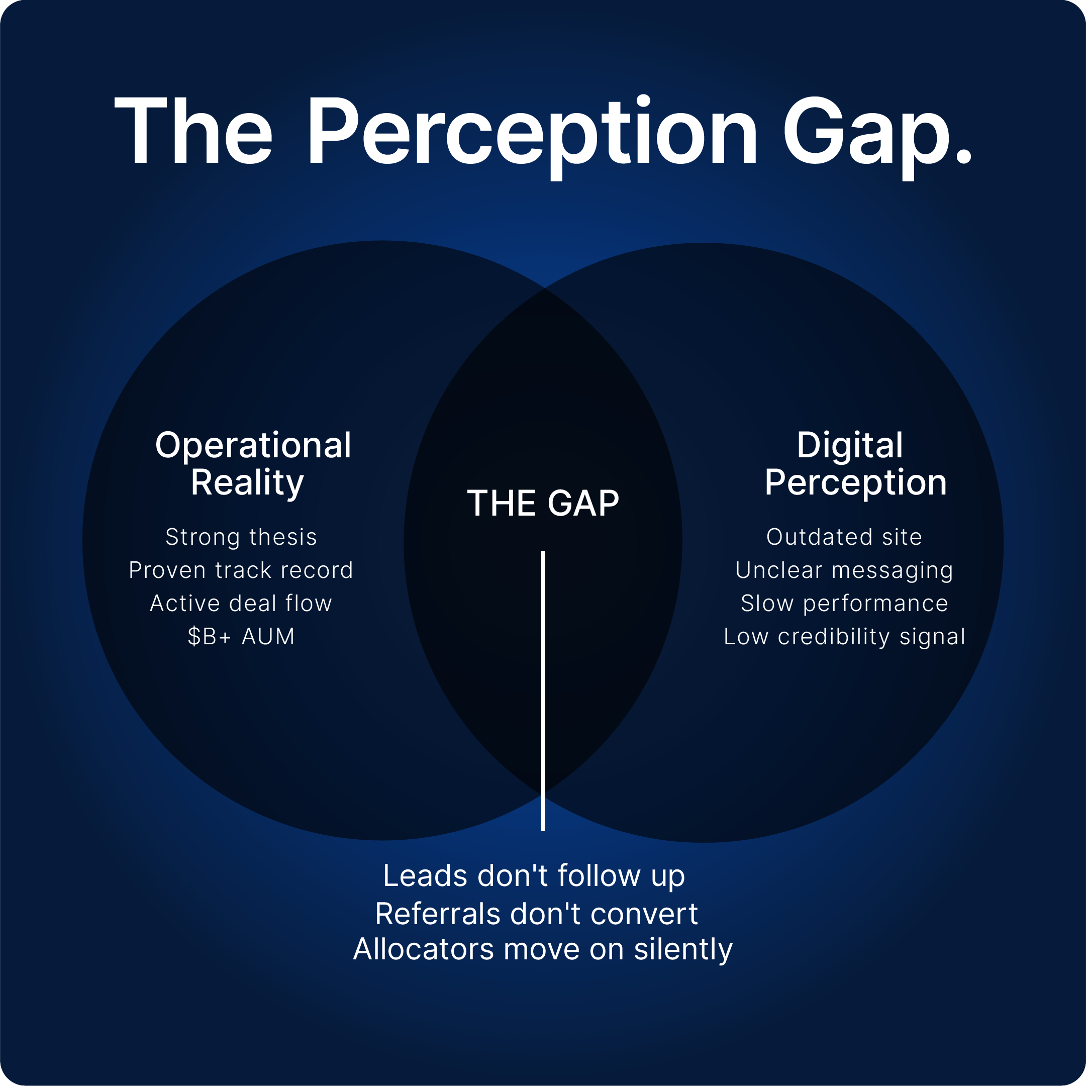
The Perception Gap
Your site is the first impression for every investor, allocator, or family office that evaluates you digitally.
If your operational performance is strong but your site doesn't reflect that, there's a gap. And that gap costs you. Not in a dramatic, visible way. In the quiet way. The leads that don't follow up. The referrals that don't convert. The allocators who moved on to the next firm without ever telling you why.
The perception gap is the space between what your firm actually is and what your site says it is. Closing that gap is the single most important thing you can do to turn digital presence into capital growth.
Who's Actually Landing on Your Site (And What They Need to See)
This is where most firms get it wrong. They build a site for everyone. But "everyone" doesn't exist in capital markets. The people landing on your site have very specific needs, and they're evaluating you against very specific criteria. Let's break it down by who they actually are.
The Institutional Allocator
This is the person at a pension fund, endowment, or sovereign wealth office who's evaluating whether your firm is worth a deeper conversation. They've probably been referred or found you through a search. They're not browsing. They're assessing.
In 3 seconds, they need to see:
What asset class you operate in
What stage of the investment cycle you focus on
Whether your AUM and track record are in the right ballpark
That your site looks like it belongs in the same room as the firms they already back
If any of that is missing or buried, they move on. They have 50 other firms to look at. You're not the only option. You're just the one they happened to click on first.
The High-Net-Worth Individual
HNW investors are different. They're not analysts running checklists. They're successful people who've built wealth and are looking for someone they trust to grow it further. Their instinct isn't analytical first. It's gut first.
In 3 seconds, they need to feel:
That this firm is serious, not amateur
That the people behind it actually know what they're doing
That the experience of working with you won't be frustrating or opaque
That you're not just another firm shouting for attention
HNW individuals are drawn to clarity and confidence. If your site is cluttered, confusing, or trying too hard to impress, it reads as insecure. They want to see a firm that's comfortable with where it stands.
The Family Office Decision-Maker
Family offices are arguably the hardest audience to win in 3 seconds. They're sophisticated, they're cautious, and they're protecting generational wealth. They're not going to commit based on a gut feeling. But they are going to eliminate you based on one.
In 3 seconds, they need to see:
Credibility signals immediately (track record, AUM, institutional language)
That your firm understands multi-generational wealth, not just short-term returns
That the site feels institutional, not like a startup trying to look institutional
A clear sense of what you do and who you do it for
Family offices spend a lot of time evaluating a lot of firms. If your site doesn't immediately signal "we belong at this level," you're filtered out before you even know you were considered.
The Warm Referral
This is the person who already heard about you from someone they trust. They're not cold. They already have a positive impression. But here's the thing: a warm referral doesn't mean a guaranteed conversion. It means they're giving you the benefit of the doubt.
In 3 seconds, they need to confirm:
That what they were told about you matches what they see
That the site reflects the quality of the firm they were told about
That reaching out feels like a natural next step, not a leap of faith
If a warm referral lands on your site and it looks outdated, slow, or generic, the referral just got undermined. The person who sent them to you looks bad, and you lose the lead before it even started.
What Failing the Test Actually Looks Like
Most firms don't know they're failing. They think their site is fine because it works, technically. But "works" and "converts" are two very different things.
Failing the 3-second test looks like this:
The homepage says everything and nothing.
Long paragraphs about your "philosophy" and "commitment to excellence." No clear signal of what you actually do, who you do it for, or what makes you different. The visitor has to work to figure out if you're relevant.
The firm type is buried.
You're a private equity firm, but your homepage doesn't say that until paragraph three. Or you manage credit strategies, but the hero section talks about "capital growth" in the vaguest possible terms. The visitor doesn't know what they're looking at.
It looks like every other finance site.
Generic stock photography. Dark blue and gold. Buzzwords like "forward-thinking" and "innovative." Nothing that tells the visitor this firm has a distinct identity or point of view. Everything blends together.
The messaging speaks to the firm, not the investor.
The site talks about your team's decades of experience, your rigorous process, your disciplined approach. All fine. But none of it answers the visitor's actual question: "Is this firm right for me and my capital?"
What Passing the Test Looks Like
Passing isn't about being flashy either, it's about being intentionally clear.
The firms that pass the 3-second test do a few things right from the moment someone lands:
They state what they do in one sentence. Not a paragraph. Not a buzzword-heavy mission statement. One sentence that tells you exactly what kind of firm this is and who it serves.
They speak to the right person. If you manage multifamily real estate for institutional investors, your hero copy should make that obvious in seconds. If you're a private credit firm connecting middle-market businesses to capital, the visitor should know that before they scroll.
They signal credibility without shouting about it. AUM, track record, press coverage, or client logos placed where they're immediately visible. Not buried in a "Results" page that nobody clicks.
They make the next step obvious. Not a confusing maze of links. Not a "Contact Us" page that feels like a dead end. A clear, low-pressure path to a conversation.
Final Thoughts
Three seconds. That's what you get. Not to impress. Not to tell your whole story. Just to answer one question for the person who landed: "Is this firm worth my time?"
If your site can't answer that in three seconds, it's not a design problem. It's a clarity problem. And clarity is fixable.
The firms that pass this test aren't the ones with the biggest budgets or the most polished visuals. They're the ones that got clear on who they serve, what they do, and why it matters. Everything else follows from that.

Let’s stay connected.
For more insight on digital strategy in capital markets, follow Kelsey from VERCEPT on LinkedIn or get in touch to discuss your next move.